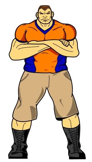
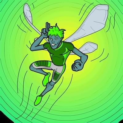
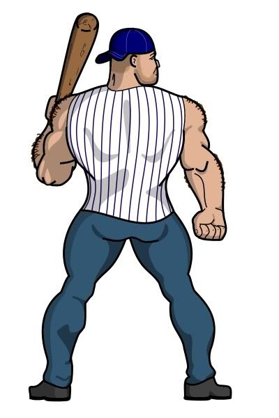
And after our last email conversation, I look forward to him being even more sinisterDustland wrote:A quick break from working on the Living Megapolis illustrations and Urbwar's rather sinister dragon man (yes, he's almost done).
NOTICE: This site has been archived. All content is read-only and registration is disabled.
A new site is being built and the Basic Action Games Discord server is an active hub for discussion and games.
-Admin
A new site is being built and the Basic Action Games Discord server is an active hub for discussion and games.
-Admin
Dustland
- urbwar
- Cosmic Hero

- Posts: 1086
- Joined: Fri Apr 09, 2010 11:00 pm
- Location: Gresham, OR
- Dustland
- Cosmic Hero

- Posts: 1158
- Joined: Sat May 15, 2010 11:00 pm
- Location: Austin, Tx
- Contact:
- Dustland
- Cosmic Hero

- Posts: 1158
- Joined: Sat May 15, 2010 11:00 pm
- Location: Austin, Tx
- Contact:
- urbwar
- Cosmic Hero

- Posts: 1086
- Joined: Fri Apr 09, 2010 11:00 pm
- Location: Gresham, OR
So as mentioned before in this thread, Dustland is doing some art for a project of mine. He asked if it was ok to post one to this thread, and I said yes. Since I was all ready online, I figured I'd save him some time, and do it myself.
This is an image of a lizradman warrior, the typical soldiers from a group in reptilian invaders. I think it came out great, and I hope you do as well:

I'm sure Dustland will have more to say about it himself, but I honestly am impressed with this piece. Much better than the original image I sent him as a reference. I look forward to having him do the rest of the art for this project, and hope people will enjoy his work when it comes out!
This is an image of a lizradman warrior, the typical soldiers from a group in reptilian invaders. I think it came out great, and I hope you do as well:

I'm sure Dustland will have more to say about it himself, but I honestly am impressed with this piece. Much better than the original image I sent him as a reference. I look forward to having him do the rest of the art for this project, and hope people will enjoy his work when it comes out!
- Dustland
- Cosmic Hero

- Posts: 1158
- Joined: Sat May 15, 2010 11:00 pm
- Location: Austin, Tx
- Contact:
- Dustland
- Cosmic Hero

- Posts: 1158
- Joined: Sat May 15, 2010 11:00 pm
- Location: Austin, Tx
- Contact:
Well, I started working on Slider but I haven't gotten any feedback from the author on him yet, so I decided to do a rough (and completely off-target) coloring of him and post him here. I'll post the real Slider when he's done.
Side note, I'm trying convince the author to publish his adventure/campaign for BASH!. As of right now it's intended for Supers, but it's been a blast and I think BASH! needs more quality adventures! You can read about it in the actual play section.
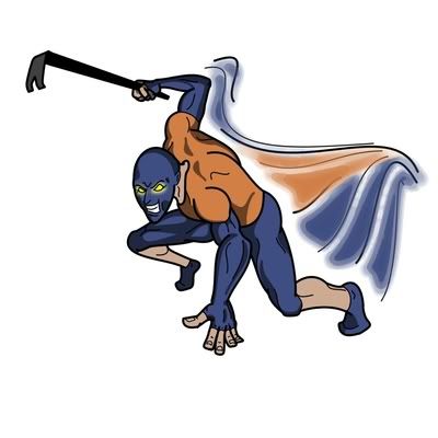
Side note, I'm trying convince the author to publish his adventure/campaign for BASH!. As of right now it's intended for Supers, but it's been a blast and I think BASH! needs more quality adventures! You can read about it in the actual play section.

- kevperrine
- Paragon

- Posts: 783
- Joined: Wed Jul 28, 2010 11:00 pm
- Location: Detroit, MI
Hey Dustland!
Your "newer" art has inspired me to wanted to give you advice from my perspective (as a graphic designer always on the lookout for new supers art in Art Direction)...
Take it or leave it. No offense in anyway - you draw better than me (funny, being a GD not liking to draw)... To be honest, my "mood" be a little cantankerous right now - I've finally just broken all ties to the girl I was going to marry (a month ago) and I'm still long-term unemployed... But I'm TRYING to be positive and helpful.... So please - grain-of-salt me on this! LOL
That said.
In my humble opinion...
You should either stick with drawing characters in your action poses, or practice-practice-practice on your more static standing poses.
Meaning ... your action poses have a neat dynamic look that it (to my eyes) more "professional" in style than your static poses. I can't say why. But my art eyes "read" your static poses as "ameteur" whereas your action poses read dynamic beginning level "professional" art.
Like I said - please take no offense. I rarely comment on art by artists unless the art inspires me to do so... So this is actually a compliment from me...
YOU are actually progressing in your style leaps and bounds. I watched a good friend, who graduated the Art Institute of Seattle go nearly the exact same "style path" that you're on now from that amateur-ish style to pro. And NOW, she works at Paizo and is on par with some of the better "animated style" artists I have seen in our hobby field. (DMac, Storn, Dan, etc..)
Anyway...
I am loving your action poses! If taking none of the above. Take that. GOOD WORK!!!
-kev-
- Dustland
- Cosmic Hero

- Posts: 1158
- Joined: Sat May 15, 2010 11:00 pm
- Location: Austin, Tx
- Contact:
Well, first, sorry about the personal affairs Kev. I almost ended up in the same boat a few years ago, having moved to California without my (now) wife. I feel for you bro.
I really appreciate the feedback on the illustrations. Is there anything specific about the static poses that make them look amateurish? I'm always open to improving, I'm on a steep learning curve right now.
And thanks for the encouragement on the action poses. I was scared to try anything too dynamic at first, but the proportions have come more easily than I thought. Things still need improvement, and after looking at Harrigan's thread, wow, long way to go!
Well, thanks for the comments and if you have any tips on the static poses, let me know sir. Also hope things start turn around for you too.
- kevperrine
- Paragon

- Posts: 783
- Joined: Wed Jul 28, 2010 11:00 pm
- Location: Detroit, MI
Dustland wrote:Is there anything specific about the static poses that make them look amateurish?
...
and after looking at Harrigan's thread, wow, long way to go!
Hey. Thanks for the thoughts on life crap. hehe...
As for any specific suggestions for the static poses. I can't say exactly. I think maybe your style just doesn't "lend" to that stand up straight look.
Think about Jack Kirby drawing a static pose. It's just not what his style is about. That's the only thing I can think of with your work.
As for Harrigan's thread. Don't compare yourself to that. It's unfair to your style. It's not in the same ballpark of style. I'd compare all those to work from the RPG artist Storn.
For your style - compare to the artists that are more "animated" in style, closer to Bruce Timm animated style. Folks like DMAC and Dan (can't remember last name ICONS illustrator). Your work is getting pretty darn comparible to Dan's. DMAC has taken his style beyond Bruce Timm into something way cool.
That's your ball park.
As I said, your action poses are getting there quick. I'd actually look to pick your work among those "animated" style as an Art Director for a new supers project based on your most recent work.
Do more of that. hehe
hope that helps.
-kev-
- Dustland
- Cosmic Hero

- Posts: 1158
- Joined: Sat May 15, 2010 11:00 pm
- Location: Austin, Tx
- Contact:
Ok, that makes sense. Thanks again for the notice Kev!Think about Jack Kirby drawing a static pose. It's just not what his style is about.
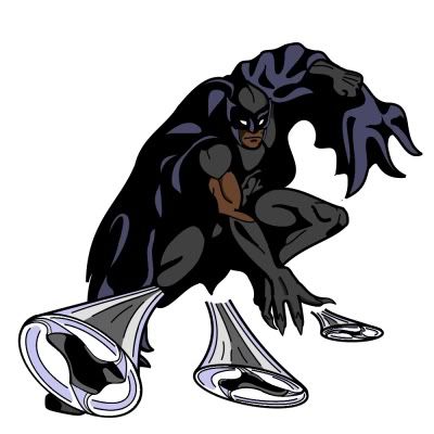
Well, here's my first paid commission I just wrapped up. It's a super hero called Black Raven for someone over at the M&M boards. His description was a black batman type. Well, I think I got him there
- BeardedDork
- Hero

- Posts: 348
- Joined: Wed Jun 16, 2010 11:00 pm
- Location: The Snow Covered Mountains of Montana
- Contact:
I agree, your work is very good, and your action poses are far better than your static poses.
But I think it would be a mistake to allow your style to be defined by things you do, I don't want to say poorly because you do them far better than I do, let's say less well.
My advice would be to pick a number like 100, 200, or 500 and draw that many static poses. Really take the time to get the most out of them you can, don't just do them quickly to get them out of the way. Every 10 or so pictures do an action pose because those are great and dynamic and you don't want to lose your knack for them while practicing your other skills.
When you finish that I think your work will move from the gifted amateur to the Amazing, then never stop practicing.
By way of constructive criticism for your static poses, your proportions are off a bit. Your characters are significantly wider at the bottom than they are at the top, and men at least aren't typically built that way. Interestingly you don't do this with your action poses.
The poses themselves tend to be a bit stiff and unnatural. It looks in a few cases like it would be uncomfortable to stand like that.
I think it would help you, if you tried to draw (to start with) your static poses at an angle, especially since you have a great sense of proportion that way.
Again, I really like your work. I look forward to watching it continue to grow.
- kevperrine
- Paragon

- Posts: 783
- Joined: Wed Jul 28, 2010 11:00 pm
- Location: Detroit, MI
- Dustland
- Cosmic Hero

- Posts: 1158
- Joined: Sat May 15, 2010 11:00 pm
- Location: Austin, Tx
- Contact:
I hadn't really noticed that before, but I see what you mean on the two big guys I did for the Living Megapolis campaign. I'll have to pay attention to that. One I can blame on trying to give him a larger midsection and just continued the proportions down from there (unintentionally).By way of constructive criticism for your static poses, your proportions are off a bit. Your characters are significantly wider at the bottom than they are at the top, and men at least aren't typically built that way. Interestingly you don't do this with your action poses.
I will be trying this!Flip the image. If you're drawing by hand look at the image in a mirror. If you're using Photoshop flip the image horizontally.
You guys are awesome, thanks. Seriously, I'm open to any other advice/criticisms so feel free to speak up!

