NOTICE: This site has been archived. All content is read-only and registration is disabled.
A new site is being built and the Basic Action Games Discord server is an active hub for discussion and games.
-Admin
A new site is being built and the Basic Action Games Discord server is an active hub for discussion and games.
-Admin
Art by Storn
- MrJupiter
- Cosmic Hero

- Posts: 1505
- Joined: Mon Apr 05, 2010 11:00 pm
- Location: Trenton, Ont. (Canada)
Glad to see more of your great work, Storn.
Zaama: I love the yellows of her attire and its sleeve embroidery. These, and her other accessories, really convey the modest nature of the character. The dark eyes mix well with her fair skin and great hair. I’ve been puzzling this piece for a few minutes now to figure out what is bothering me about it. I think it all sits with her posture. I mean no disrespect but her eye focus and the positioning of her right hand, and staff-wielding left, suggest that she has become wary of a possible threat - but her feet are too close together and her knees lack the slight bend to suggest that she is ready for what ‘might’ be needed in the next moment. Its like as if the camera picture was snapped just a fraction of a second early. She probably wouldn’t move her legs into any extremely obvious stance of readiness, because such posturing might be excessive at this early stage. I’m not really sure how well I’ve conveyed my thoughts about this but, otherwise, this illustration of Zaama is great.
Reeka: This is a really nice piece and well done in all fronts. I really like the contrast between the corset and shoulder-less dress. She really looks like she could handle herself as easily in a dark alley tangle as she could in the aristocratic infighting of an upper class, social event.
Jewel: She is captivating on all fronts. The facial jewelry must have taken a long time to arrange, but the effect is fantastic. I’m not sure if her gloves are silver or some kind of pliable pearl material, but they look great. Another great Death Tribble concept fantastically rendered.
It’s always nice to see your posts on the forum here, and I love your work. May I ask what your current commission rate is?
- Storn
- Costumed Crimefighter

- Posts: 114
- Joined: Fri Jan 20, 2012 12:00 am
- Location: Ithaca, NY
- Contact:
First off, lets get the marketing/business thing out of the way first. Its been some time, but I just released another clipart Portfolio from LPJ Designs, the 24th! And this is a big one, 8 pics of art!!! I really appreciate all the commissions that I get, to continue to be able to provide this reasonable priced art for indie and small publishers. So thank you all who give me your character concepts to bring to visual life.
The link to the the portfolio is here: http://lpjdesign.rpgnow.com/product/113 ... Storn-Cook
and remember, you can preview the entire portfolio (or any of them) before buying, so you know exactly what you are getting.
Next up, Paul C. has me take concepts I've already illustrated, from his games, and put them into actual scenes. It is a ton of fun and Paul's descriptions are excellent and I think I've really gotten better at painting from the practice.
First up, Vampire and Tiefling vs. Dryder. This is my first all-acrylic pic I've painted in quite some time. I use acrylic often as an under painting, but after talking to fellow artists, Jeff Szuc and Steve Ellis, I decided to use clear matte medium as my glazing medium, instead of water. I tend to like to sneak up on color with glazes and tints. With water, I always got this kinda blotchy glazes and tints and wasn't happy with it. With matte medium, I got a nice even distribution and it handled like oil paint. Score!!!
And I decided to not really go for a cover format, allowing myself to use all the space, especially at the top for action.
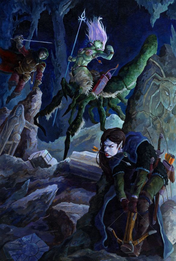
Commissions are my experiment time. And this next one was a real experiment for me. I did the WHOLE thing digital. Now, I tend to do somewhat tight pencils for paintings. Here are the pencils for VnT vs D above.
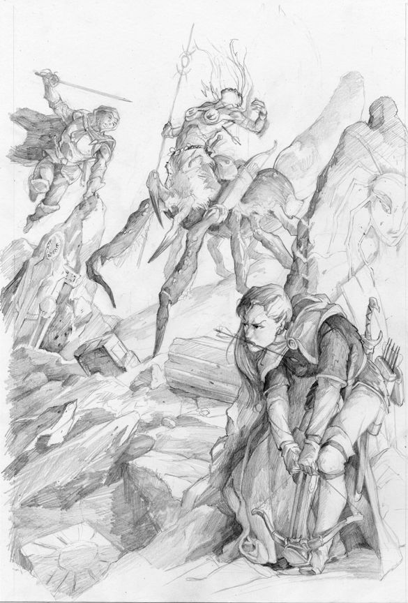
V n T vs D sketch
Then I went in on that and did a fairly tight underpainting. But here is my digital sketch, which, was made possible by my cintiq and Manga Studio 5 made the perspective stuff really quick. So, really sketchy and loose. Paul asked for a stone golem, which I slipped sideways in concept to a stone marble golem.
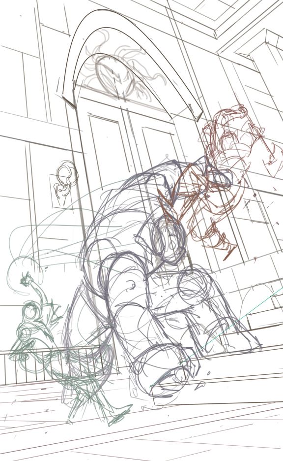
This painting is "designed" to be a cover, even though there is no actual product for it to be on. But after the Dryder painting, I didn't want to get lazy in thinking about that.
And here is the finish. I really like Manga Studio 5 more and more. I used it for about 70% of this digital piece, bouncing to Painter and Photoshop for specific functions. Manga Studio's pencil and oil tools are few, but I really dig their them. And the blending tool is as good as Painters, which I love...and far superior to Photoshop's.
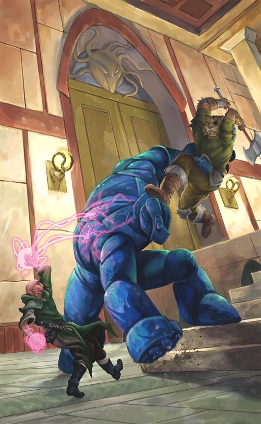
So. There you have it. A peek behind some recent experiments. And by the way, these are both available as prints at: http://fineartamerica.com/profiles/stor ... 5803&page=
Also, if there are any publishers who want 1st print rights at a reasonable rate for either (or both), drop me a line at storn.cook@gmail.com. These won't ever be in a clipart portfolio, as too much time went into them as well as the specificity of their narrative.
The link to the the portfolio is here: http://lpjdesign.rpgnow.com/product/113 ... Storn-Cook
and remember, you can preview the entire portfolio (or any of them) before buying, so you know exactly what you are getting.
Next up, Paul C. has me take concepts I've already illustrated, from his games, and put them into actual scenes. It is a ton of fun and Paul's descriptions are excellent and I think I've really gotten better at painting from the practice.
First up, Vampire and Tiefling vs. Dryder. This is my first all-acrylic pic I've painted in quite some time. I use acrylic often as an under painting, but after talking to fellow artists, Jeff Szuc and Steve Ellis, I decided to use clear matte medium as my glazing medium, instead of water. I tend to like to sneak up on color with glazes and tints. With water, I always got this kinda blotchy glazes and tints and wasn't happy with it. With matte medium, I got a nice even distribution and it handled like oil paint. Score!!!
And I decided to not really go for a cover format, allowing myself to use all the space, especially at the top for action.

Commissions are my experiment time. And this next one was a real experiment for me. I did the WHOLE thing digital. Now, I tend to do somewhat tight pencils for paintings. Here are the pencils for VnT vs D above.

V n T vs D sketch
Then I went in on that and did a fairly tight underpainting. But here is my digital sketch, which, was made possible by my cintiq and Manga Studio 5 made the perspective stuff really quick. So, really sketchy and loose. Paul asked for a stone golem, which I slipped sideways in concept to a stone marble golem.

This painting is "designed" to be a cover, even though there is no actual product for it to be on. But after the Dryder painting, I didn't want to get lazy in thinking about that.
And here is the finish. I really like Manga Studio 5 more and more. I used it for about 70% of this digital piece, bouncing to Painter and Photoshop for specific functions. Manga Studio's pencil and oil tools are few, but I really dig their them. And the blending tool is as good as Painters, which I love...and far superior to Photoshop's.

So. There you have it. A peek behind some recent experiments. And by the way, these are both available as prints at: http://fineartamerica.com/profiles/stor ... 5803&page=
Also, if there are any publishers who want 1st print rights at a reasonable rate for either (or both), drop me a line at storn.cook@gmail.com. These won't ever be in a clipart portfolio, as too much time went into them as well as the specificity of their narrative.
- Storn
- Costumed Crimefighter

- Posts: 114
- Joined: Fri Jan 20, 2012 12:00 am
- Location: Ithaca, NY
- Contact:
- Storn
- Costumed Crimefighter

- Posts: 114
- Joined: Fri Jan 20, 2012 12:00 am
- Location: Ithaca, NY
- Contact:
Long Hiatus
I've been very busy this summer, some of it not art related, some of it was. Went on a very nice vacation to Salem, Oregon with my wife to visit her daughter. Had a wonderful time.
Came back to Grassroots here in Ithaca (Trumansburg), NY, 4 days of bands from around the globe. Just 4 miles from our house. Unfortunately, Millie, my wife, got some kind of allergic reaction to something and we ended up waiting in a lot of medical waiting rooms. She is fine now. We are not quite sure what triggered it.
And I've been working on doing "plates" (re: backgrounds) for a movie... off and on. Which was really fun and difficult. Lots of new terminology to learn, lots of hard mental thinking trying to marry the actors in front of the green screen to the creators vision of what the background was supposed to be. Really neat job. I hope to share some of that soon.
Right now, I have 3 Legend of the 5 rings card art on my table and I'm pleased with how they are coming out. I'm doing 2 traditionally (combo of acrylic underpaint, oil finishes) and 1 digitally. But all three start out as pencil drawings.
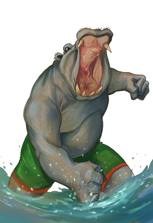
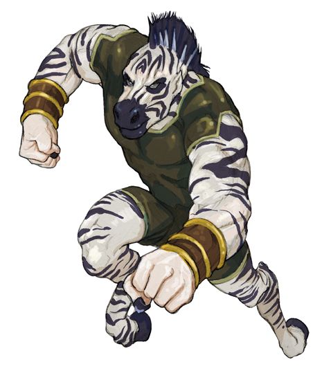
Commissions really took a back seat while doing the movie job. But I've gotten a couple done recently for Death Tribble, both anthromorphics. One, of course, is a bit of a pun... courtesy of DT. I do love a bad pun! Presenting Hippochondria. Zebra was kinda interesting, because the description pushed him towards "Brick" archetype instead of the speedster like archetype. I love going against type. Check 'em out!


- MrJupiter
- Cosmic Hero

- Posts: 1505
- Joined: Mon Apr 05, 2010 11:00 pm
- Location: Trenton, Ont. (Canada)
- Storn
- Costumed Crimefighter

- Posts: 114
- Joined: Fri Jan 20, 2012 12:00 am
- Location: Ithaca, NY
- Contact:
I wanted to post this earlier, but I've been rebuilding my website after it gathered a horrendous virus. I just completed a bunch of fantasy commissions and they are compiled into one of LPJ Design's Storn Cook Portfolios, number 25 to be exact! So, if you are looking for good resolutions of my artwork for clip art, look no further! Link here:
Storn Cook Portfolio # 25: http://www.rpgnow.com/product/117747/Im ... rs=0_0_0_0
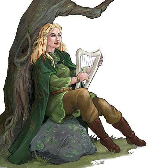
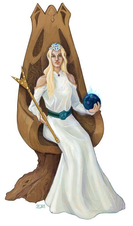
Here are couple of samples from Portfolio #25 (and you can see all of the art of any of the portfolios before purchase, no blind buys, over at RPGnow). Kind of a strange selection because I was asked for THREE sitting poses. I rarely get asked to do single figure commissions with specifically sitting situations. Fun!
Also, check out my new banner art for my website, you can see it up top on my web/art/blog/site. And put here for showing off sake:

Storn Cook Portfolio # 25: http://www.rpgnow.com/product/117747/Im ... rs=0_0_0_0
Here are couple of samples from Portfolio #25 (and you can see all of the art of any of the portfolios before purchase, no blind buys, over at RPGnow). Kind of a strange selection because I was asked for THREE sitting poses. I rarely get asked to do single figure commissions with specifically sitting situations. Fun!


Also, check out my new banner art for my website, you can see it up top on my web/art/blog/site. And put here for showing off sake:

- Storn
- Costumed Crimefighter

- Posts: 114
- Joined: Fri Jan 20, 2012 12:00 am
- Location: Ithaca, NY
- Contact:
- MrJupiter
- Cosmic Hero

- Posts: 1505
- Joined: Mon Apr 05, 2010 11:00 pm
- Location: Trenton, Ont. (Canada)
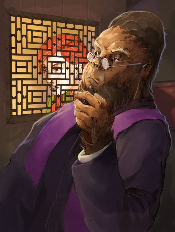
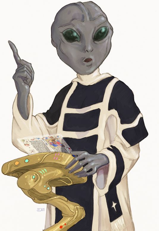
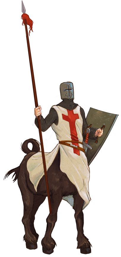
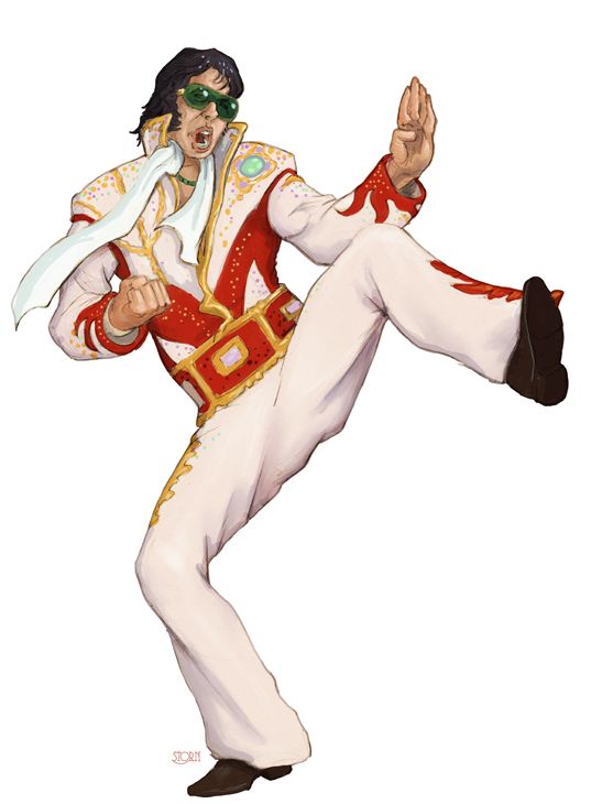
Your Elvis is a real fun image to look at. I love the concept idea of the Cavalier Centaur. I had never thoaught of that combination, which now seems so obvious I wonder why it never occured to me before. The alien's podium and holographic "scriptures" are fantastic.
The favourite one one of this bunch has to be the Ape Taking Confession. It makes me wonder what he has to be thinking of the primate branch which fancies itself as "more evolved".
The favourite one one of this bunch has to be the Ape Taking Confession. It makes me wonder what he has to be thinking of the primate branch which fancies itself as "more evolved".
- Storn
- Costumed Crimefighter

- Posts: 114
- Joined: Fri Jan 20, 2012 12:00 am
- Location: Ithaca, NY
- Contact:
Well, my site caught hacked again, after I wiped out everything. So, I went to Securi, spent the money and had them clean the site and together, a bit more security (hopefully) was put into place.
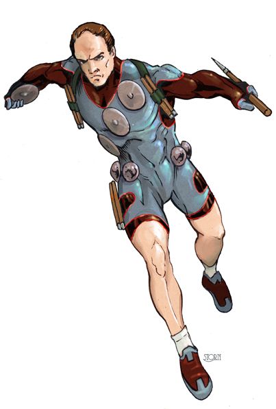
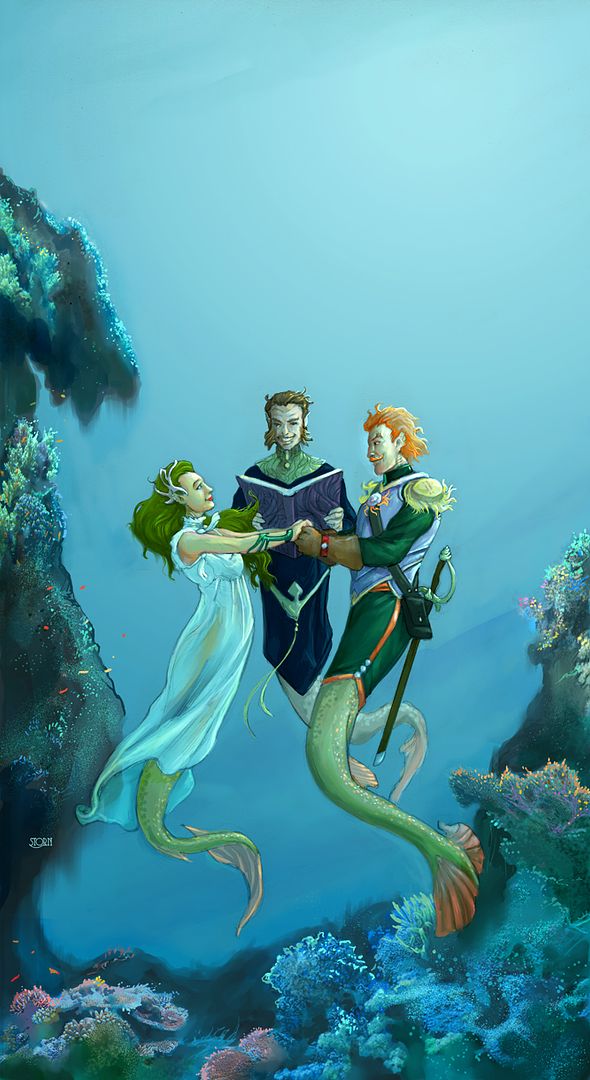
Meanwhile, I've been getting artwork done. Here are a few pieces! Here are one from Paul L., his last of his oddball religious illos he had me do. And the Decathelete (my title) for Death Tribble as a new take on the "weaponmaster" archtype on super-hero/villain.
Working a lot with toned paper on these, doing both pencil to darken, and white acrylic for highlights. Then working with multiply, normal and color overlay levels in Photoshop and Manga Studio. I'm kinda digging it.


- Storn
- Costumed Crimefighter

- Posts: 114
- Joined: Fri Jan 20, 2012 12:00 am
- Location: Ithaca, NY
- Contact:
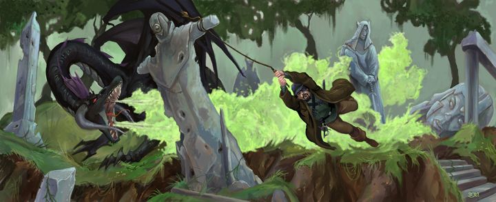
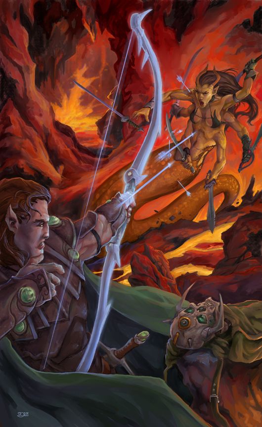
Paul C is one interesting patron. He has me do the usual single figure commissions for his fantasy game. But then he turns it up a notch and gives me these scenes to do with the previously done characters. And I get to do ACTION! I like doing action. A lot. These are a lot of work, but boy, both of these were SOO much fun to do. Getting to do monsters, neat locales and heroes in motion.
You know you are having fun when working late at night and your wife calls you to watch something and you can't tear yourself away. I hope that comes across
. Don't get me wrong, I like introspective scenes, single figures, landscapes...heck, I like doing pretty much all art. When I haven't done black and white brush/ink work in awhile, it is really nice to come back to that medium... or if I've been doing a lot of digital, it is nice to pick up an actual paint brush.
Both of these are digital, but the Black Dragon one was done over a very loose thumbnail, because I liked it a lot better than the pencils I was working on (more energy) from that thumbnail. Which I promptly abandoned about 1/3rd of the way through. Conversely, Marilith was done from pretty tight pencils on bristol. Both times I did sorta digital underpaintings with a tone layed down, punching the blacks up a bit and then going in with white to pick out highlights.
I'll shut up now and show the art.


- MrJupiter
- Cosmic Hero

- Posts: 1505
- Joined: Mon Apr 05, 2010 11:00 pm
- Location: Trenton, Ont. (Canada)
The DnD-anna Jones picture is phenominal in every way! I love the chlorine gas breath weapon (its been years since DnD so i hope that I've assumed correctly). Most art with dragons seem to focus upon the red, fire-breathing variety, so its nice to see this type (especially when it is so nicely done)!
P.S. Your archer's bow, from the flaming subterrainian piece, has inspired a character idea for me. Thanks!
P.S. Your archer's bow, from the flaming subterrainian piece, has inspired a character idea for me. Thanks!
- Storn
- Costumed Crimefighter

- Posts: 114
- Joined: Fri Jan 20, 2012 12:00 am
- Location: Ithaca, NY
- Contact:
Awesome!!! Love hearing that my pics inspire game elements!MrJupiter wrote:The DnD-anna Jones picture is phenominal in every way! I love the chlorine gas breath weapon (its been years since DnD so i hope that I've assumed correctly). Most art with dragons seem to focus upon the red, fire-breathing variety, so its nice to see this type (especially when it is so nicely done)!
P.S. Your archer's bow, from the flaming subterrainian piece, has inspired a character idea for me. Thanks!
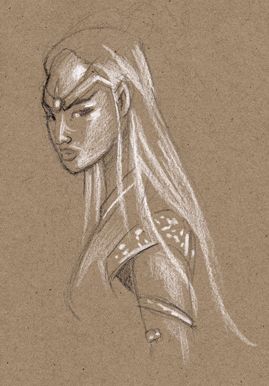
I purchased today at the Standard Art Supply in Ithaca, NY, a new white pencil. It is a big, huge, thick white pencil that I hope doesn't break like my prismacolor white pencils always do INSIDE the pencil part. A tip breaking is fine, I can resharpen, but I hate when a color pencil breaks multiple times inside the wood and the lead starts falling out. Grrr.
So this was a quickie little sketch that I did at a coffee shop. I liked it, so I scanned it in and posted it for funnsies... not finished artwork by any stretch. The new pencil, by the way, is for Lyra, called, appropriately, "Color-Giants" and made in Germany. While I had a pencil sharpener, it is too fat for it and I didn't have my usual pen knife, so a bit awkward and clumsy for detail work...but I liked the feel for it. Hope when sharpened by a knife, get a bit more of a point to work with. At the moment, it is bit more like a crayon. But I like the solidity and feel of the pencil. The tip might break, but the lead won't break inside the wood due to any kind of normal wear and tear.
- fairytalejedi
- Hero

- Posts: 311
- Joined: Tue Jun 05, 2012 11:00 pm
- Storn
- Costumed Crimefighter

- Posts: 114
- Joined: Fri Jan 20, 2012 12:00 am
- Location: Ithaca, NY
- Contact:
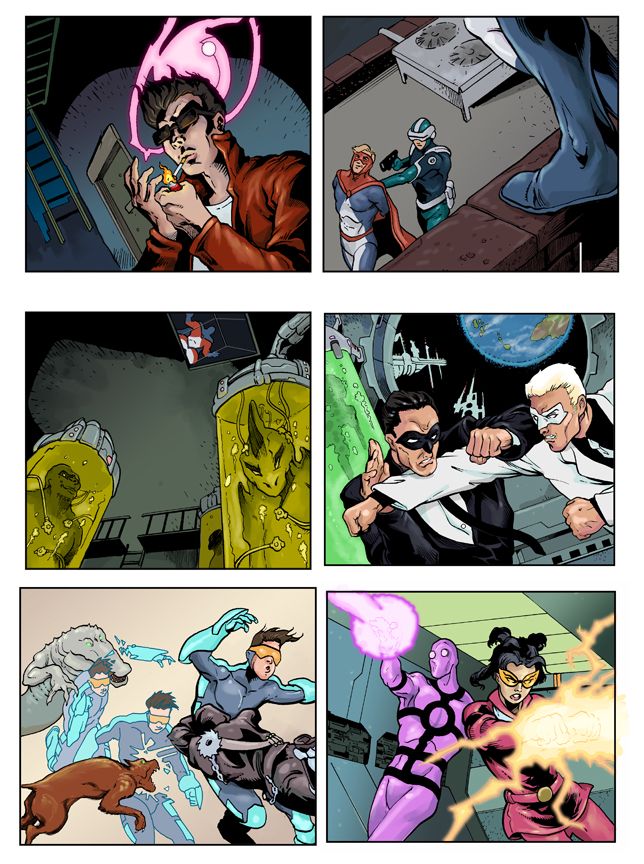
Here is some work I did awhile ago, but got permission to post. It is for a virtual card game for facebook, and the working title is Phaeton. I don't know how far along it is, or quite how it is played. But the core concept is based around some kind of school for teen supers, ala X-mansion.
My friend Steve Ellis was lead artist and art director on this one, and it was both fun and tough to work with the constraints and character concepts he had set up. Tough in that we have very different ways of working, especially when it comes to inking. So, I was trying to come close to his inking style. But that was fun too, because it pushed and prodded me to really think about how I do things and I learned a lot.
So here are a smattering of images that I done for the game.
